Which Areas of Graphic Design Needs Higher Attention?
Which Areas of Graphic Design Needs Higher Attention?
byRiyaonApril 10, 2023 & 13:00 [IST]2 Min Read
Graphics design is an artistic process by a skilled designer using the software. Infographic designers craft these outstanding designs with typographic elements, typefaces, lines, colors, and white spaces.
It communicates to the user through visual content and people witness it in their daily routines. Logos, newspaper images, broucher, etc, are real-time examples of graphic design.
Here are some important mistakes to avoid while designing your communication design.
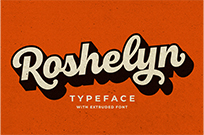
1. Poor Typography
Sometimes, designers might select more than two font styles to make their designs outstanding. But, it is a wrong decision and you can transform your design as the best with one single standard font.
Using too many fonts with irrelevant styles may completely spoil your graphic design. So, avoid this mistake to get an attractive design.
2. Ignoring Visual Hierarchy
Visual hierarchy is the basic principle of graphics design that defines the organization of the elements. Such as size, color, illusions, font organization, grids, spaces, and other visual factors of the infographic design.
The main content of the design should be a bit larger than the other text. To give an idea, the exact message for the user should be in place of the header and others in the subtitle, then the body text.
3. Inconsistency of Font Colors
"Color plays a vital role in creating eye-grabbing designs. In order to make the design contrasting and visually aesthetic designers might fill the text with inappropriate shades"
It makes your design unpleasant and difficult to read your text. Therefore, maintain consistency while applying contrast effects for font styles.
4. Improper Alignment of Elements
Certain elements must be placed in the center and others in upper or lower part of the design. Align the text and pictures in a particular order, it should convey the exact information at the first sight.
Design the elements after selecting the best color scheme, raster images, and font styles to get a better result. Use grids to place visual elements in a specific arrangement.
5. Absence of White Space
Imagine you are designing an excellent graphic with a good choice of color scheme and typography without negative space. How it will look like? Terrible right.
Therefore, required amount of gaps are essential to creating a good visual design. Avoid this mistake, and leave sufficient space between every element like lines, texts, logos, and images.
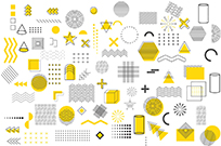
6. Selecting Stock Images
Stock images are pictures that are already shot for the use of others. It saves precious time for the designers but as well-trained professionals, you should avoid using them.
Because these are mostly available in low resolution and make your project look usual. Generic images are not only the options you can go with high-resolution pictures to make your design seems attractive.
7. Not Considering Medium
Medium is nothing but, where your graphics is going to appear. You can be designing it for television advertisements, posters, social media ads, or newspapers. So, designers need to be conscious of choosing color theory, shapes, sizes, and typefaces according to the different mediums.
If it is for a newspaper, then graphic designers must apply CMYK color mode. And so, for displaying your design in the system, switch to RGB mode. Ensure you follow these steps to create an artistic infographic.
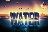
8. Using More Words Instead Of Visuals
Typography is important in graphics but not more than visual elements. Infographic designs should include more appealing images, lines, textures, colors, and spaces to communicate with users in a better way.
Avoid too many words or text in the graphic design to make your project understandable by looking at once.
9. Bad Kerning and Tracking
Many designers confuse kerning and tracking because both terms indicate the spacing between texts.
"Tracking is adjustment of space in the overall typographic elements like lines, words, or completes a passage"
Unnecessary space in between every word or line looks like scattered letters placed over the design instead of giving meaningful content.
Bad kerning is a spatial distance between individual characters of the text. These are used to shape letters or text in different alignments in the overall design. Leaving more spaces ruins the look of graphics so make sure you provide sufficient gaps.
10. Choosing the Wrong Format for Images
In graphics design raster and vector images are available. Vector helps to create digital illusions, logos, and complex graphics where as raster is an image made up of pixels.
Both shares equal space in designing but after completing the graphics the end file should be saved in a proper format. Here is the format for such images.
Raster format
-
JPEG
-
GIF
-
PNG
-
TIFF
-
RAW
-
PSD
Vector format
Bottom Lines
Be conscious of the up-listed mistakes and avoid them while designing your graphics for different mediums. Practice using the latest software technologies and create efficient eye-grabbing graphics design.
Anisa
Anisa is a passionate content writer residing in the US, capable of searching for insight to deliver the new information every time. She is pretty brilliant in finding a fantastic method to highlight her concept in a unique and credible way that satisfies the engaging users with enough stuffed info. Each word builds on research to deliver the quality result as the visitors really want to know.
More Posts from Anisa